When it comes to web development, modals play a vital role in presenting significant information or interactions without the need to leave the current page. In the past, building modals required complex JavaScript and CSS coding. However, with HTML’s <dialog> tag, the process has become incredibly simple.
Now, let’s explore a basic illustration of how to create a modal using only HTML. We’ll also add a touch of JavaScript and CSS for interaction and visual appeal.
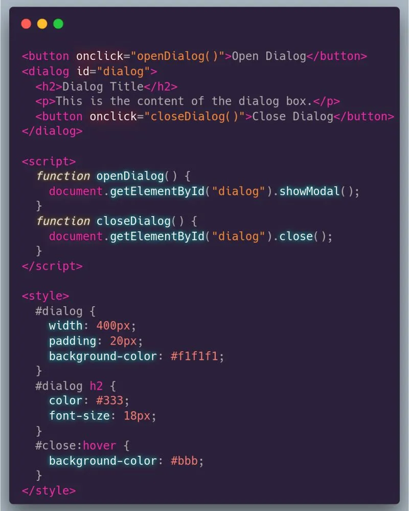
HTML
<button id="open-btn">Open Dialog</button>
<dialog id="dialog">
  <h2>Dialog Title</h2>
  <p>This is the content of the dialog box.</p>
  <button id="close-btn">Close Dialog</button>
</dialog>
<button id="open-btn">Open Dialog</button>: This button initiates the opening of the dialog.<dialog id="dialog"> ... </dialog>: The<dialog>tag encapsulates the modal content.<button id="close-btn">Close Dialog</button>: This button initiates the closing of the dialog.
JavaScript
document
  .getElementById('open-btn')
  .addEventListener('click', () =>
    document.getElementById('dialog').showModal(),
  );

document
  .getElementById('close-btn')
  .addEventListener('click', () => document.getElementById('dialog').close());
document.getElementById('open-btn').addEventListener('click', ...): This event listener triggers the showModal() function, displaying the dialog, upon clicking the “Open Dialog” button.document.getElementById('close-btn').addEventListener('click', ...): This event listener employs the close() function to close the dialog when the “Close Dialog” button is clicked.
CSS
#dialog {
  width: 400px;
  padding: 20px;
  background-color: #f1f1f1;
}

#dialog h2 {
  color: #333;
  font-size: 18px;
}

#close-btn:hover {
  background-color: #bbb;
}
As it’s just an HTML, you can style it however you want.
Complete Code
<html>
  <head>
    <style>
      #dialog {
        width: 400px;
        padding: 20px;
        background-color: #f1f1f1;
      }

      #dialog h2 {
        color: #333;
        font-size: 18px;
      }

      #close-btn:hover {
        background-color: #bbb;
      }
    </style>
  </head>
  <body>
    <button id="open-btn">Open Dialog</button>
    <dialog id="dialog">
      <h2>Dialog Title</h2>
      <p>This is the content of the dialog box.</p>
      <button id="close-btn">Close Dialog</button>
    </dialog>

    <script>
      document
        .getElementById('open-btn')
        .addEventListener('click', () =>
          document.getElementById('dialog').showModal(),
        );

      document
        .getElementById('close-btn')
        .addEventListener('click', () =>
          document.getElementById('dialog').close(),
        );
    </script>
  </body>
</html>
By utilizing this simple HTML and incorporating some JavaScript and CSS, you have successfully designed a practical modal. This serves as an illustration of how the <dialog> tag simplifies the process of creating modals.